January 23, 2020
Most creative strategies prompt a “call to action.” But what happens when that call-to-action is to stop the action?
01 // THE ISSUE
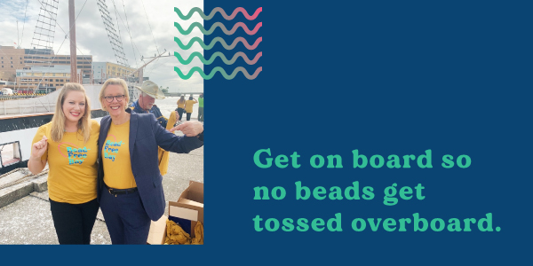
Tossed Overboard
Tampa Bay loves to celebrate, usually in the form of parades. One key ingredient of a good parade is beads. A Tampa parade guarantees colorful, funny-shaped necklaces flying in the air from all directions. As a city located near water, parade-goers sometimes join in the fun by boat. But the water that separates beads and boats creates a problem. Plastic beads tossed to boaters fall short and end up spending eternity in our bay.
There’s a simple solution that keeps the fun and mitigates environmental repercussions:
Don’t throw beads into the water.
It’s that simple. A call to no-action. The forefront of this effort needed to address environmental issues without pointing blame.
02 // BRANDING
All the Fun, Without Any of the Pollution
Any negative connotations about throwing beads risked causing an uproar. We didn’t want anyone to misconstrue the sentiment as a promotion for a complete ban on beads.
(Tampanians strongly believe in their right to bear beads).
Creating a brand for a social cause like this requires eye-catching visuals that attract attention. The message wasn’t about a total lockdown on bead-throwing festivities. It intended to ensure attendees did not neglect their environment.
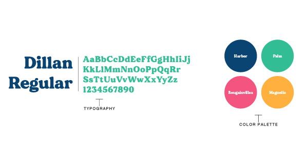
First, this identity began with a color exploration. Since the cause promoted environmental awareness, we sought bright, fun and natural colors. We chose blue, teal, coral and a sunset-inspired yellow and floral and marine-inspired names. The selection reminded parade-goers of their impact on the surrounding area.
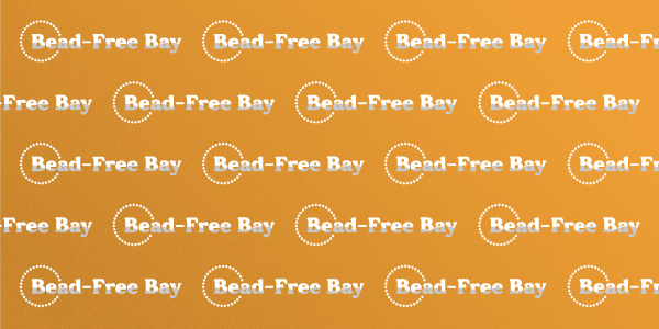
Next came type, the main player in the wordmark. Because we wanted the type to stand out, we avoided thin-weighted and characterless fonts that blended in the background. In the end, we selected a bold, serif typeface with a timeless essence that stood out.
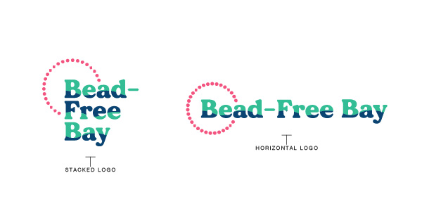
Finally, we accented the wordmark with some flair and created a few iterations. They included gradient waves to thin waves that took a backseat to type. Ultimately, a simple dotted bead accompanied the wordmark. The watermark was also cut in half to create a simple wave pattern down the middle of the letters.
03 // REFLECTIONS
A Ripple Effect
Working with the city of Tampa gave us direct insights into the problem and how to solve it. As far as design, we were free to explore any avenue, which gave us full control over this identity. This compelled us to have a holistic view and keep the brand’s use outside of the agency at the tops of our minds. Keeping the identity clean and simple allowed easy adaption for signage, social and merchandise. Mayor Jane Castor and the city shared unwavering support for this identity initiative. Our call to no-action will help keep Tampa beautiful without minimizing an annual tradition.