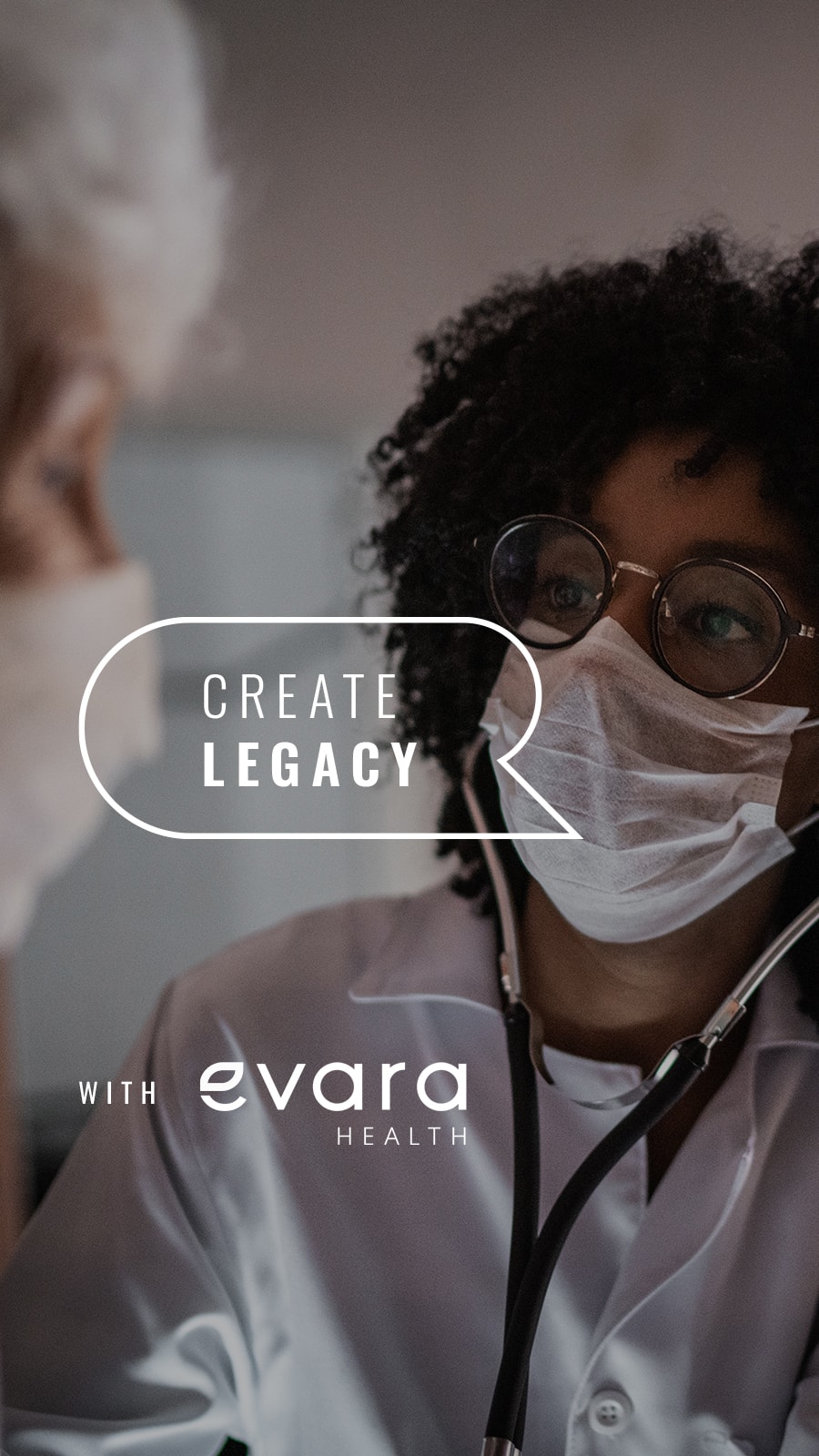
Create Legacy with Evara Health Create Legacy with Evara Health

Breaking the Barrier to Equity in Health

Integrity and unshakable passion for equitable healthcare powered the historical foundation of Community Health Centers of Pinellas (CHCP) for over four decades. They positively disrupted the narrative that quality healthcare with a family-like touch is only for the insured. As a beacon of hope for Pinellas County, CHCP’s highly aspirational future needed a rebrand to match. They called on us to build a vibrant brand that stayed true to their roots and signaled the vision of where the organization is headed.

Welcome to Evara Health.

With inclusivity at the center of their customer experience, we knew the new brand had to build on the passion of the tenured team, their innovative leadership, and the generations of patients CHCP has served across Pinellas County. Our in-depth brand discovery process, Inside and Out™, powered the insights that led to every brand deliverable, including the new name. Inspired by interviews with their doctors and stakeholders, we designed each element to fire up pride in their community and activate team members to become ambassadors of their rich history and optimistic future. And considering the 50-person flash mob at their internal launch party, we’d say that goal was achieved.

The Name

More than a shiny (and shorter) new name, Evara (pronounced eh-ver-ah) has roots in the words “everyone” and “everlasting” which inspires relationships built on trust that span generations.
Evara Health Logo - Before and After
Collage of Evara Health Brand Work
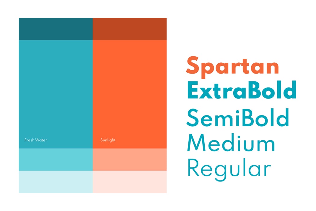
Evara Health Font Family
Evara Health Embroidered Logo

The Foundation

Focused on their inclusive culture, our rebrand built advocacy around Evara’s 40-year history while inspiring long-time ambassadors with a renewed purpose: to deliver one-of-a-kind care with a “no matter what” mentality.

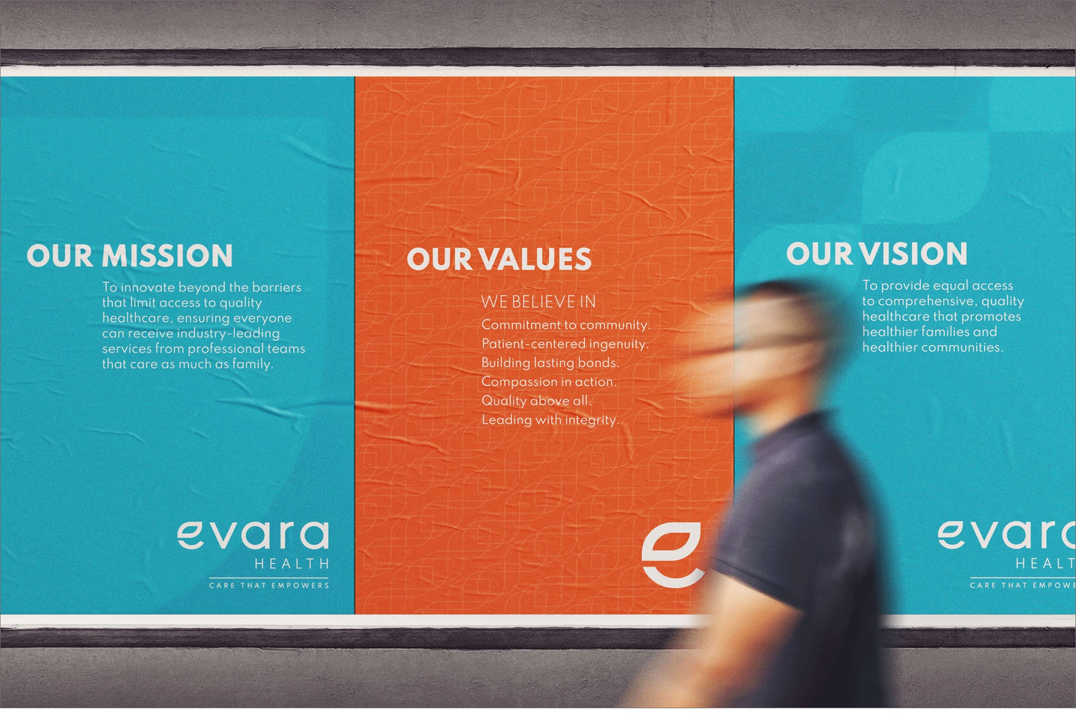
Evara Health Brand Posters
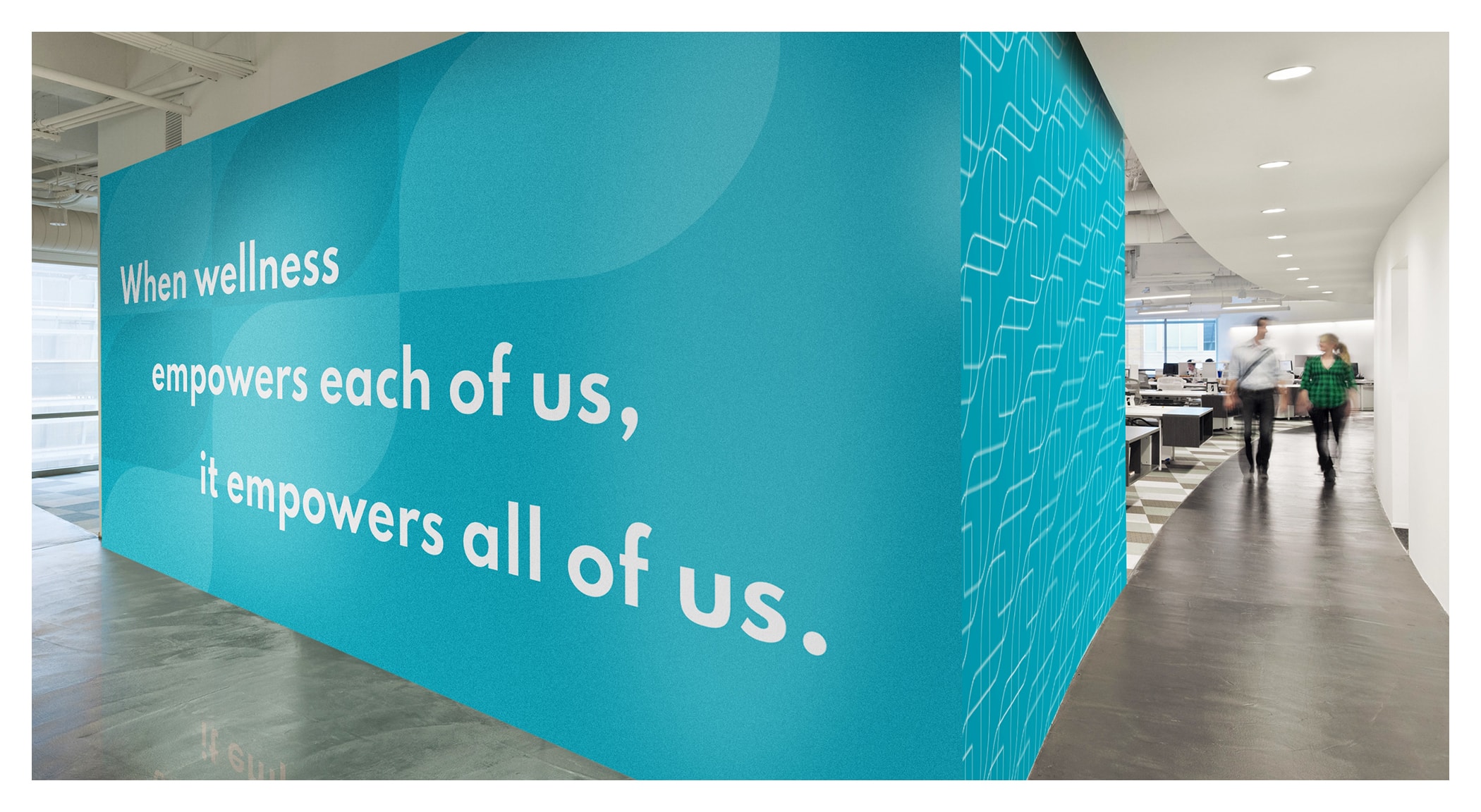
Evara Health Interior Design

The icon and the system

The visual identity also has roots, quite literally, in a beautiful flower that grows in dark, mucky waters. Inspired by the lotus which becomes most beautiful when it finally reaches sunlight, the “e” icon lotus leaf is designed to be worn as a symbol of pride –inspiring healthier homes across all kinds of communities.

Expanding the icon across the design system becomes a useful pattern and set of compositional shape that symbolizes our dedication to bringing equitable healthcare to one patient, one family, one neighborhood at a time.

The system of colors creates vibrancy that activates the walls throughout the operations office and reinforces the passion and purpose of the providers walking the hallways adorning the colors for each division they serve.

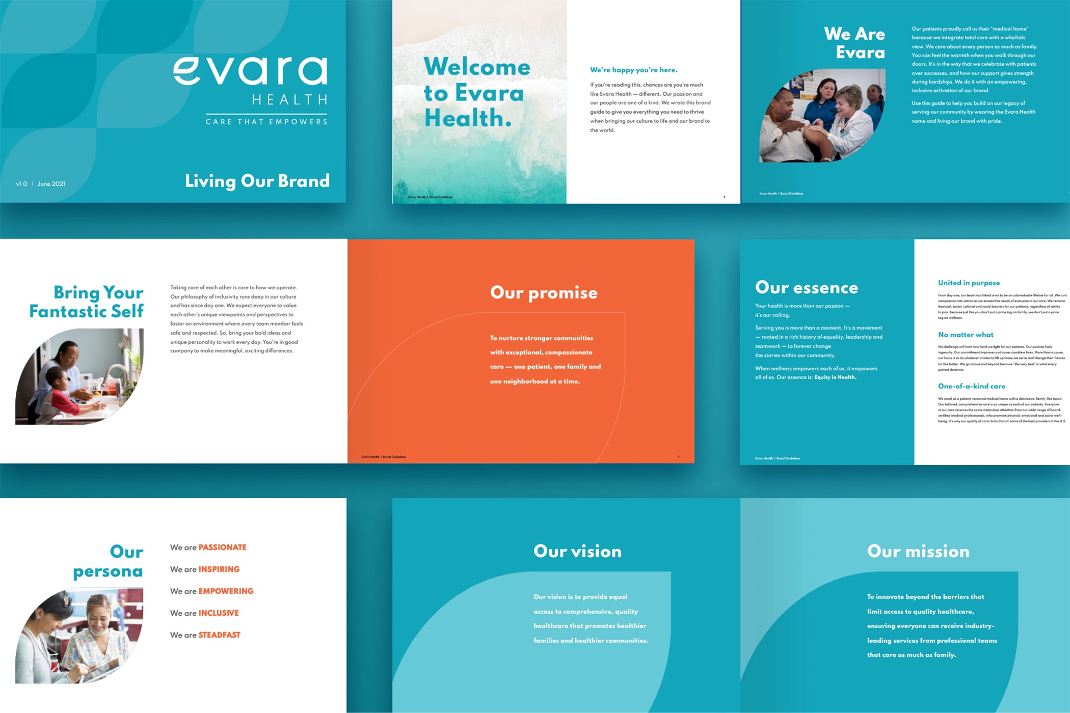
Evara Health Brand Guide
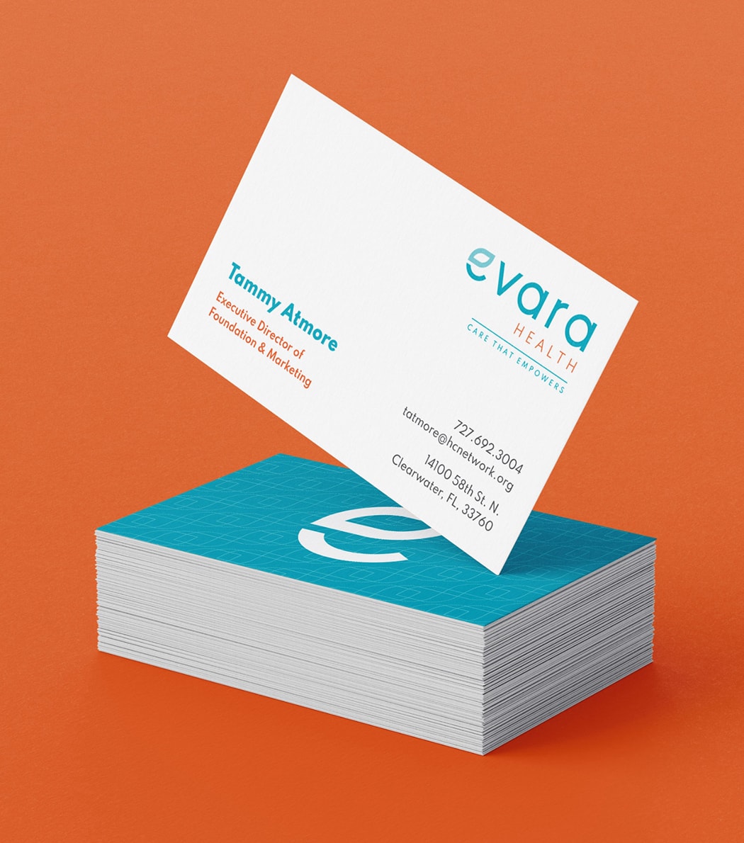
Evara Health Business Cards
Evara Health Vehicle Wrap
Evara Health Outdoor Board

Next Project

Photo of woman looking at photos with Tidewell Hospice worker
Tidewell Hospice

Shifting Emotions into Action.

SEE THE WORK