Bringing Downtown to Your Backyard
North of the City of Tampa, Land O’ Lakes is a sub-market that’s growing quickly, and master-planned community Bexley is creating the area’s newest commercial and dining destination. They just needed to give their brand-new space a brand of its own. Because we helped the Bexley community grow from its first hundred residents to now almost being sold out, they tapped us to give this destination a full-blown brand story, design, and name.
As an extension of Bexley, the brand had to appeal to the current residents’ lifestyle – a.k.a. huge cycling culture. This led to the name The Hub at Bexley™. Plucked from the dictionary as a double entendre, The Hub alludes to a place’s focal point and the central part of a bike wheel. See what we did there? Context clues.
But the name is only part of the brand’s success.
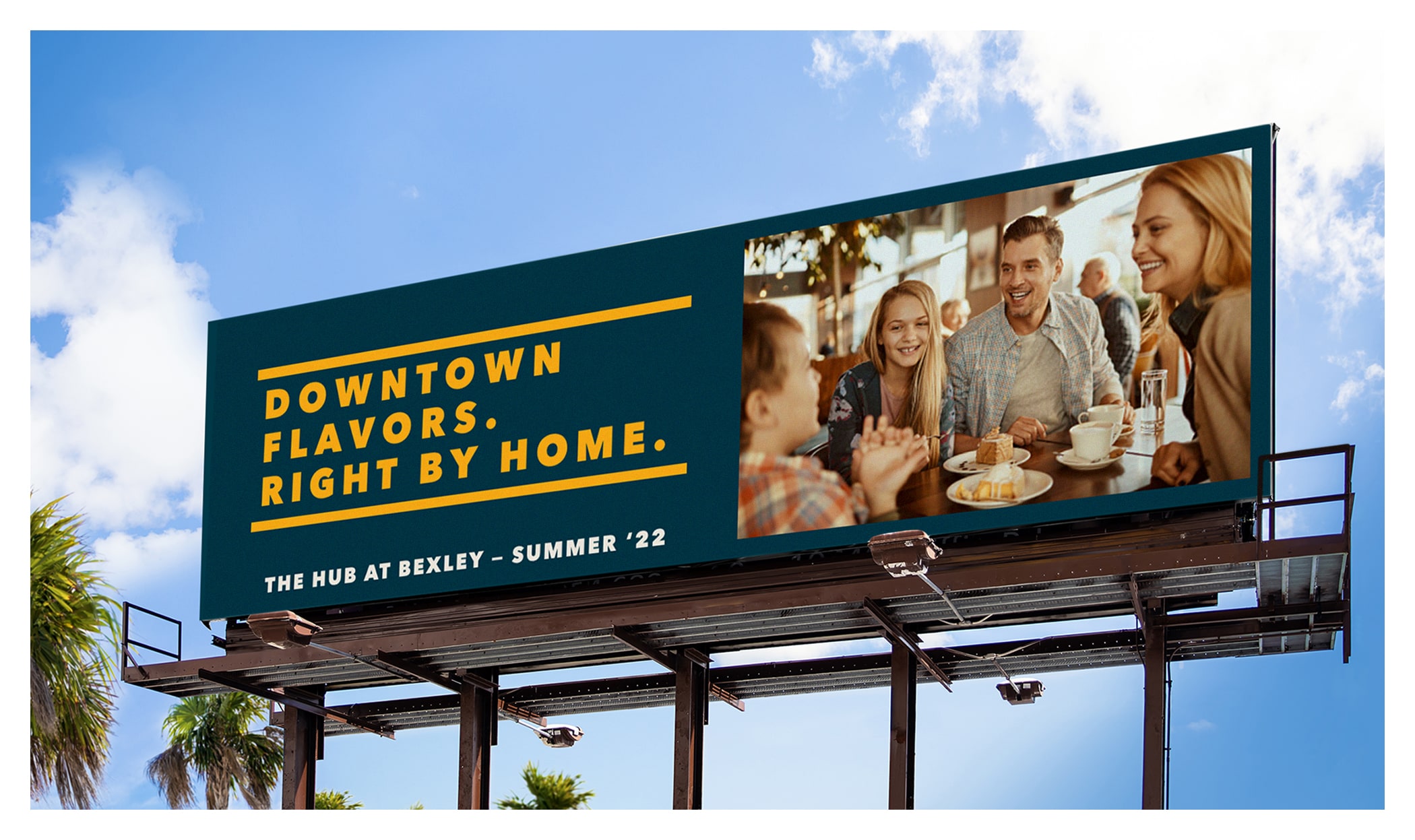
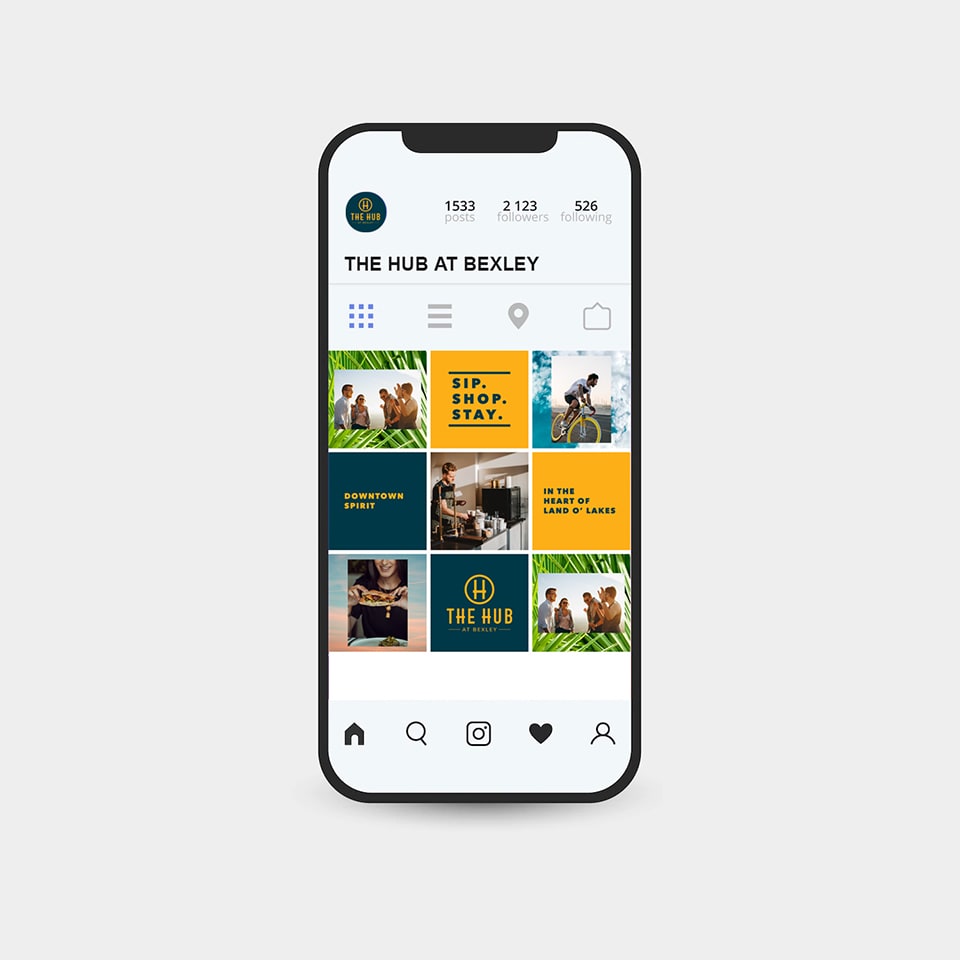
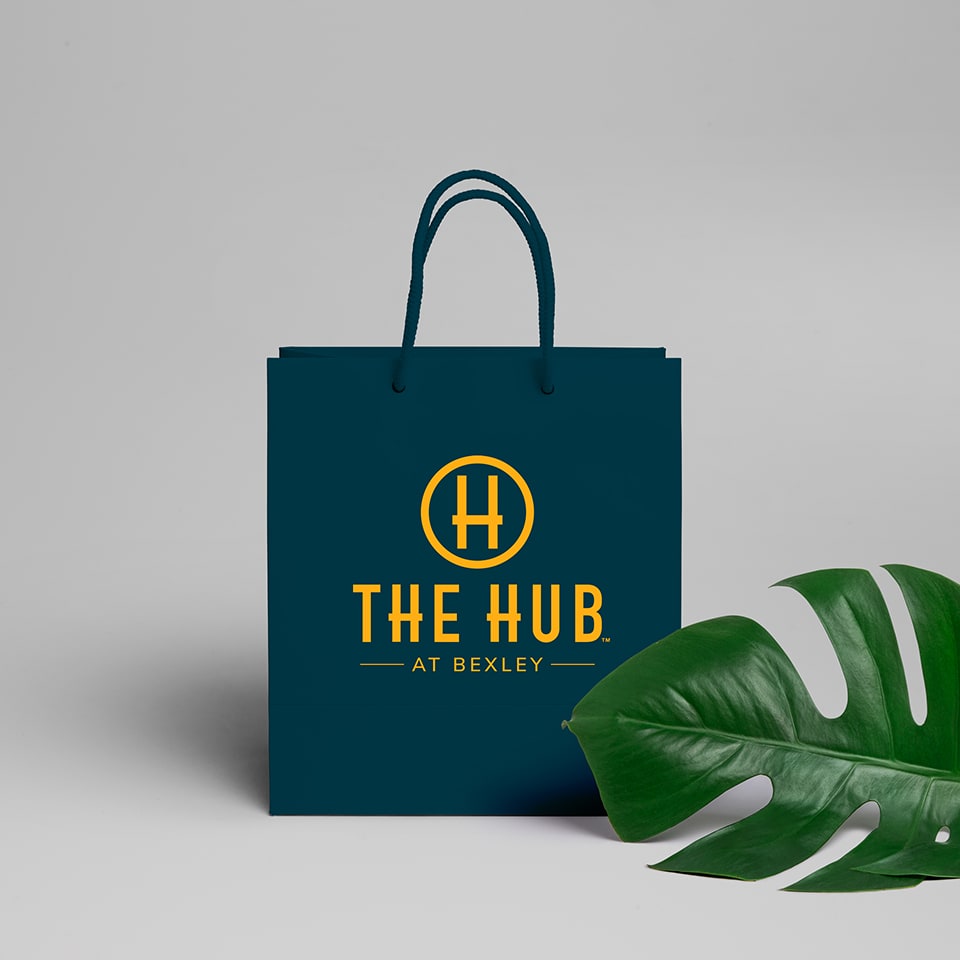
The logo and color palettes represent the welcoming, laid-back atmosphere that Bexley’s known for. A timeless type treatment, icon, and sophisticated color palette makes The Hub™ stand out from other developments and links this brand to Bexley’s.
Since branding The Hub™, they’ve secured dozens of tenants from beloved local brands to national chains across dining, services, healthcare, hospitality, and more.
