Create Possibilities with Feeding Tampa Bay Create Possibilities with Feeding Tampa Bay

TransformING Communities Through a Brand Revolution

Feeding Tampa Bay didn’t just move into a new building in 2025, they created a hub of opportunity for those in need in our communities. More than a structure – it’s serving neighbors through job training, health exams, financial and educational assistance, access to healthy and fresh foods as well as hot meals. Feeding Tampa Bay became more than a food bank, they are now the largest social services program in the region. And they needed a brand to match.
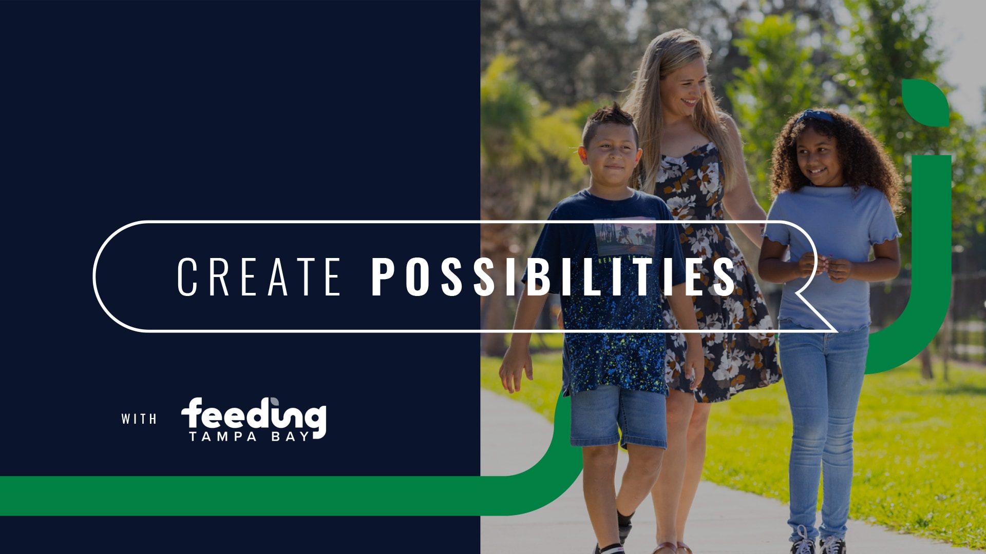
The new brand story highlights how Feeding Tampa Bay is feeding with more than food. They are feeding opportunities that create pathways toward solutions for neighbors across the Tampa Bay region.

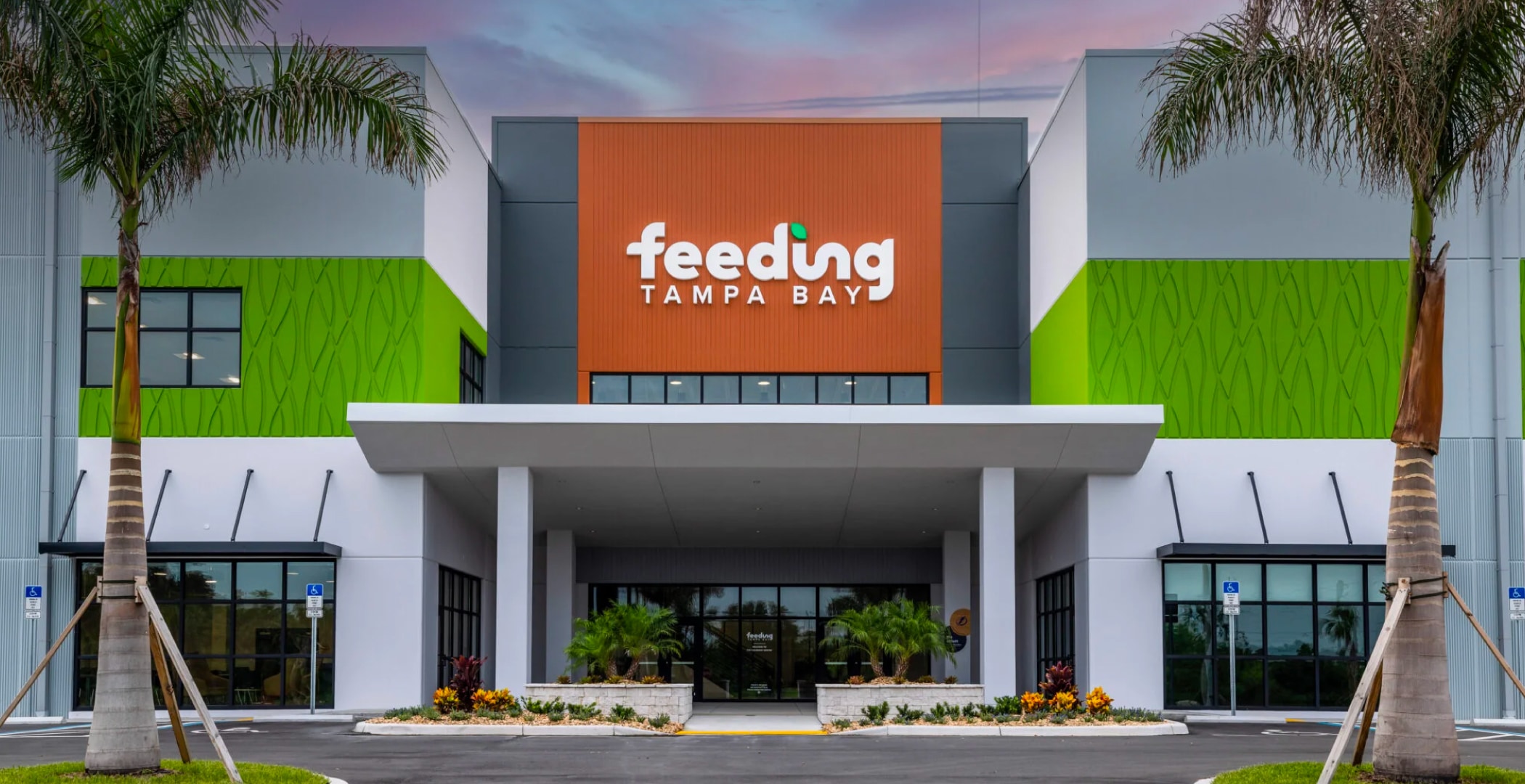
A photo showing the front of the Feeding Tampa Bay office building with the logo large on the front.
Artwork on the walls inside Feeding Tampa Bay's offices that read: Connecting. Learning. Growing.


The brand design takes an optimistic perspective inspired by the limitless possibilities of looking to the sky. This informed the evolution to a brighter color palette and design system that expresses a persona of charisma, sincerity and inventiveness. The brand’s vision “path” now symbolizes new beginnings as the “sprout” that creates the pathway to possibilities.

Two open spreads of a Feeding Tampa Bay brochure reading It's Possible – create possibilities when you give, share and connect – you can help power our impact
Spreads of the Feeding Tampa Bay brand guidelines, which show rules for colors, photography and other graphic elements
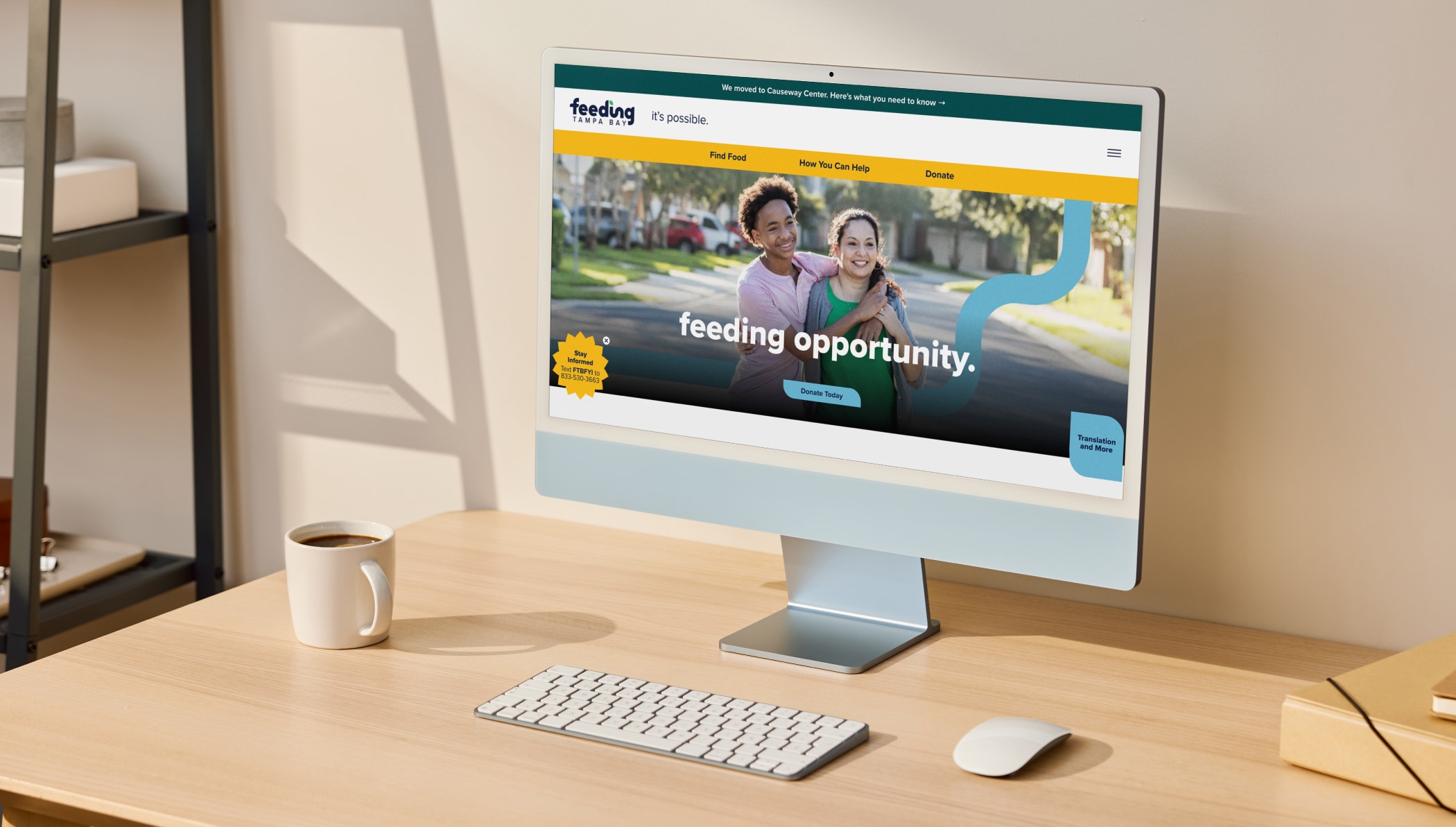
The Feeding Tampa Bay website homepage which shows a photo of two teenagers and a headline that reads: Feeding Opportunity
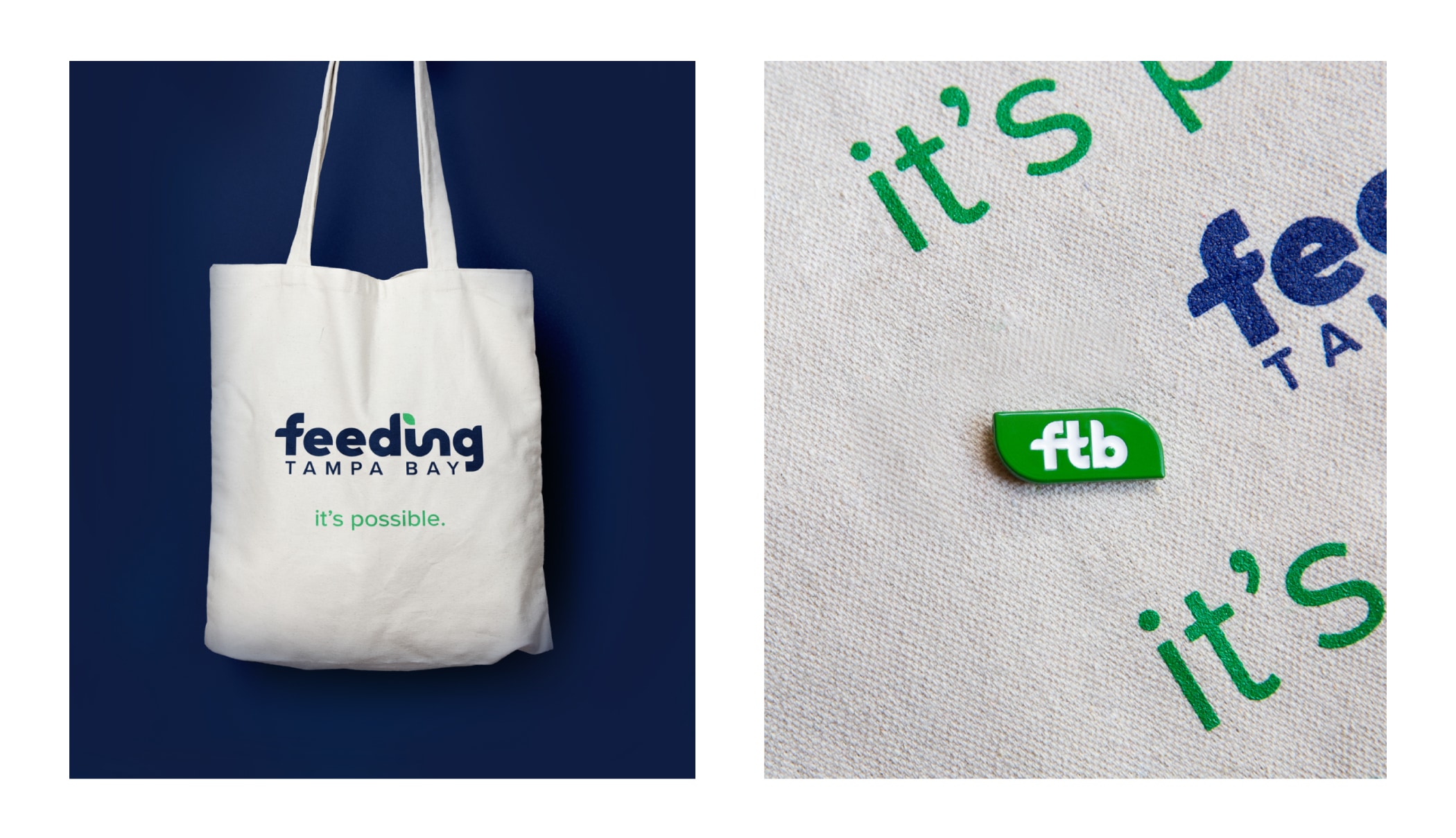
Photos of a Feeding Tampa branded tote bag and lapel pin

Next Project

Tampa Bay Rays

RAYS UP FOR NIKE’S CITY CONNECT

VIEW THE WORK