January 31, 2022

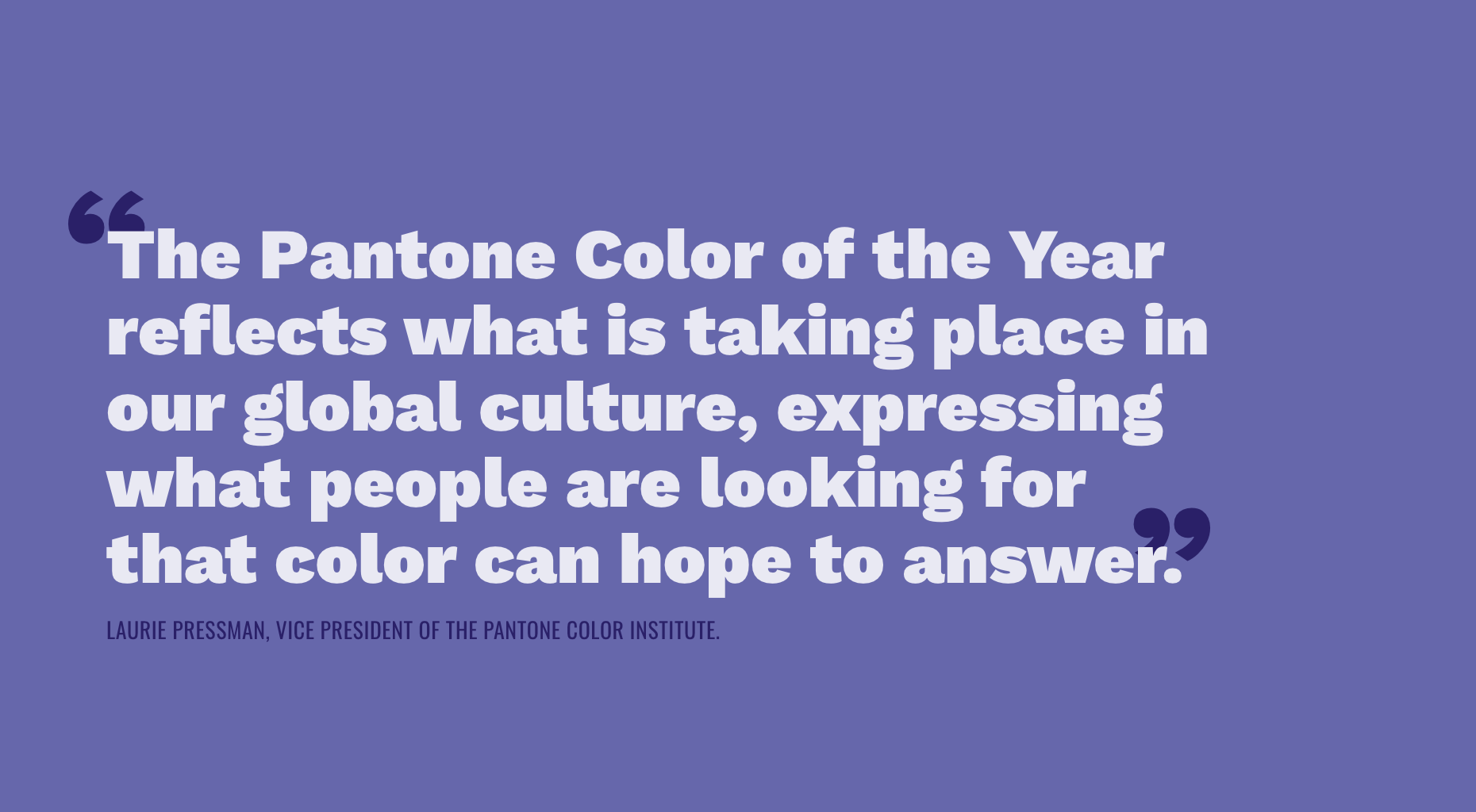
It’s a new year, full of new possibilities, opportunities, and another Pantone Color of the Year. This year, the color that will guide us through the (hopefully not as universally hated as the previous two) new year is Very Peri. PANTONE 17-3938 to be exact. Something unique about the soon-to-be beloved Very Peri is that it was the first color created in Pantone’s Color of the Year educational color program, further connecting it to the innovative and transformative feelings it evokes. This year’s color is described as a “red violet infused blue hue”, and I wouldn’t be mad about it – being the very color of the accent wall in my apartment. Pantone says that this color will help us to “embrace this altered landscape of possibilities and open us up to a new vision as we rewrite our lives.” I like the sound of that.
How Did Pantone Choose 2022’s Color of the Year?
Pantone monitors global trends and color influences that influence their decision. Anything from movies to socio-economic conditions can be a source of inspiration. The chosen hue can influence multiple industries from fashion, interior design, and advertising (which is why we’re especially excited for Very Peri). While trends and influences from around the planet help inform the yearly shade selection, a crucial part of the process and really any color selection is color psychology.
What is Color Psychology?
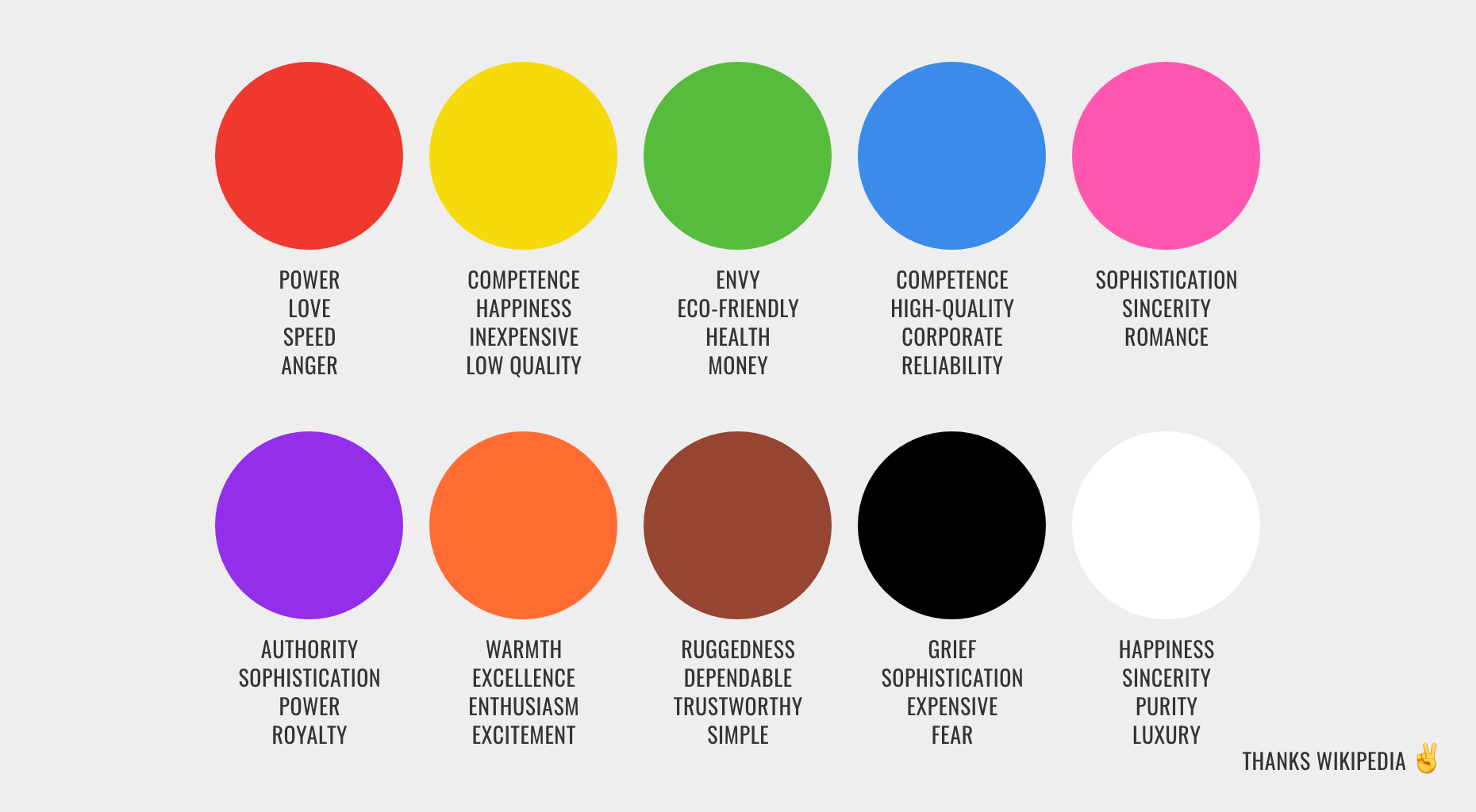
Color psychology is simply the study of color and how it influences human behavior. Do you ever wonder why gold and brown colored food packaging makes us think that it’s somehow homemade? That’s color psychology. Ever feel sophisticated wearing an all-black suit? Color psychology. Ever wonder why that particular shade of Twitter blue makes Wendy’s so sassy? Okay, I’m still wondering about that too. Color psychology is behind all those obvious influences (green = dollar, dollar bill y’all) but can also be a bit more complex. A certain color or color palette can be tethered to a specific memory. Colors can even shape and become part of a region’s culture. As a creative agency, we intentionally use color psychology in our branding process.
A Simple Breakdown of Color Psychology in Branding
When ChappellRoberts builds a brand, there’s a lot of work to be done before we talk brand colors. Every brand needs a mission, vision, and value statement, as well as an essence, promise, and persona to steer the brand in the right direction well after your visual brand is created. Brand names and taglines are up next. They form a brand’s visual identity and help craft every designer’s favorite, two-syllable word: logo. Color is always in the back of our minds throughout the entire branding process, but we must have a solid foundation set before painting. Once we have all the pieces laid out, we start trying on different color palettes to feel what fits.
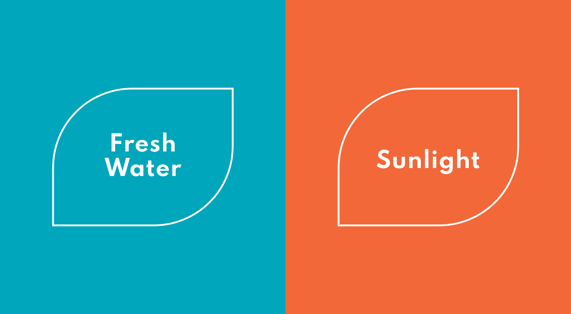
A recent brand venture our team went on was with Evara Health, formerly Community Health Centers of Pinellas, a patient-centered medical home with a family-like touch. A big visual signifier in the logo was the lotus flower which symbolizes the infinite potential of healthier communities. Louts Leaves grow in dark, murky waters and achieve their full potential when they reach sunlight. The brand colors we chose were dubbed “Fresh Water” and “Sunlight”, two things found in nature that help us stay healthy. We wanted a peaceful color that represented what patients would feel when being cared for at Evara which led us to a more blue-leaning teal. We also wanted a bright and warm color that represents the potential Evara sees in every person which led us to a vibrant orange.
So as we move into the new year, has Pantone’s Very Peri worked its magic on you yet? Do you feel ready to use color to your advantage in your branding efforts?