October 13, 2021
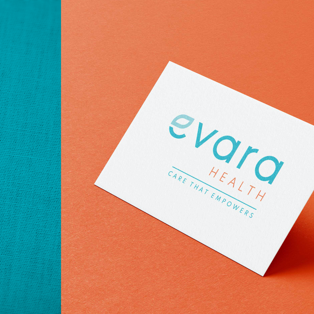
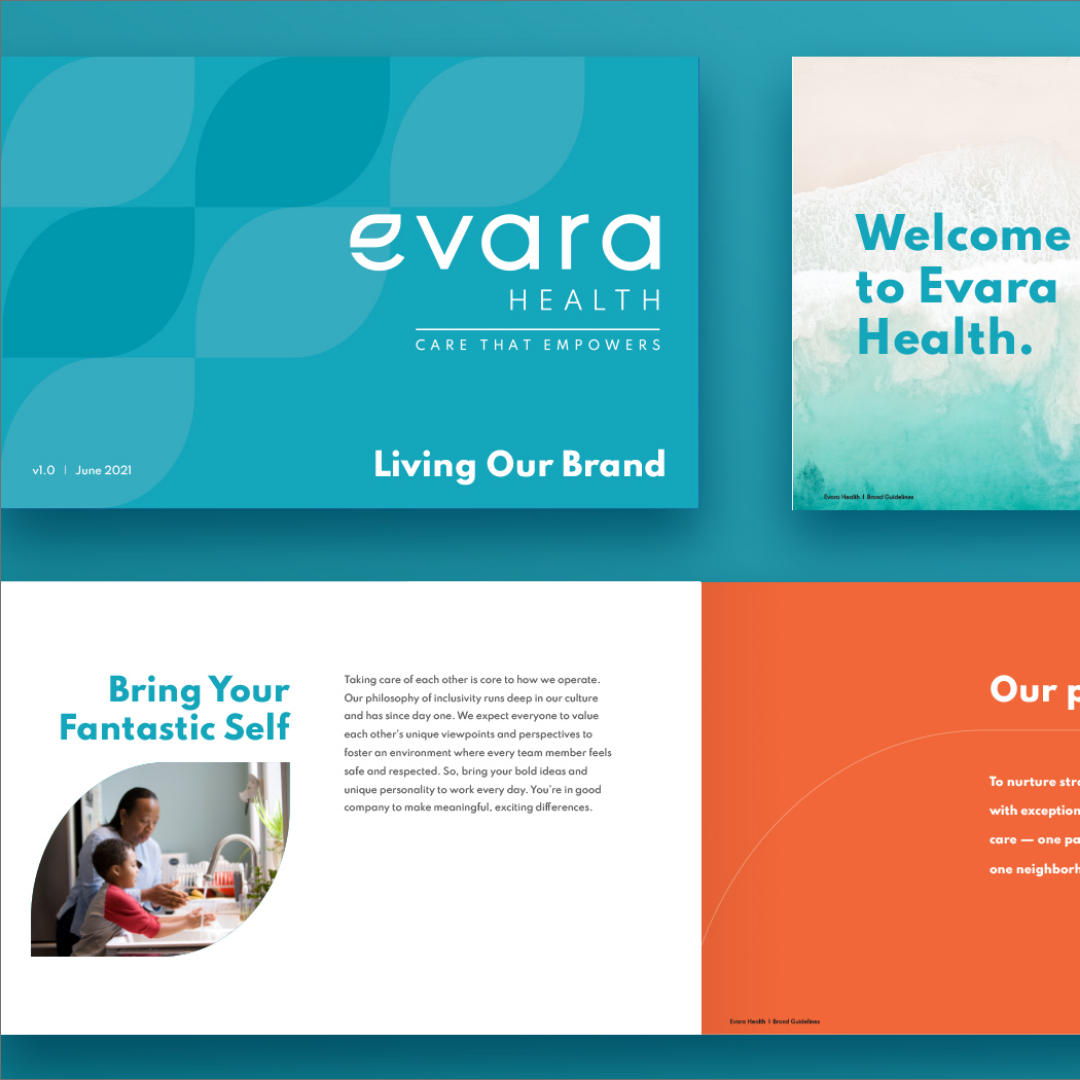
Introducing Evara Health: our latest rebrand for Community Health Centers of Pinellas County. More than a shiny (and shorter) new name, Evara (pronounced eh-ver-ah) has roots in the words “everyone” and “everlasting” which signifies the trust built in every relationship that runs strong for generations. The visual identity also has roots – in a beautiful flower that grows in dark, mucky waters. Inspired by the lotus which becomes most beautiful when it finally reaches sunlight, the “e” icon lotus leaf is designed to be worn as a symbol of pride –inspiring healthier homes across all kinds of communities.


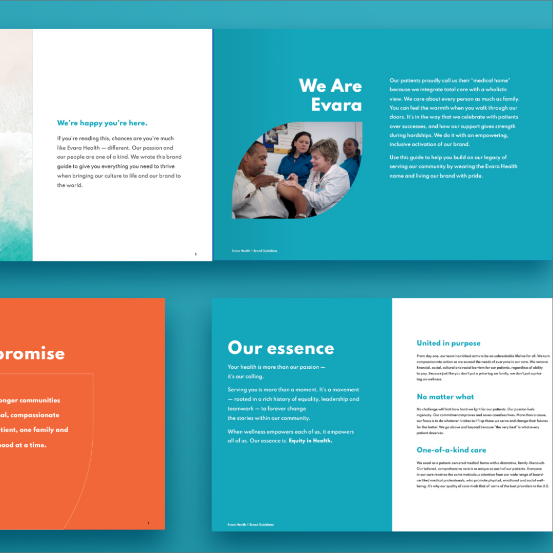
Focused on culture, our rebrand built advocacy around Evara’s 40-year history while inspiring long-time ambassadors with a renewed purpose – to deliver one-of-a-kind care with a “no matter what” mentality.
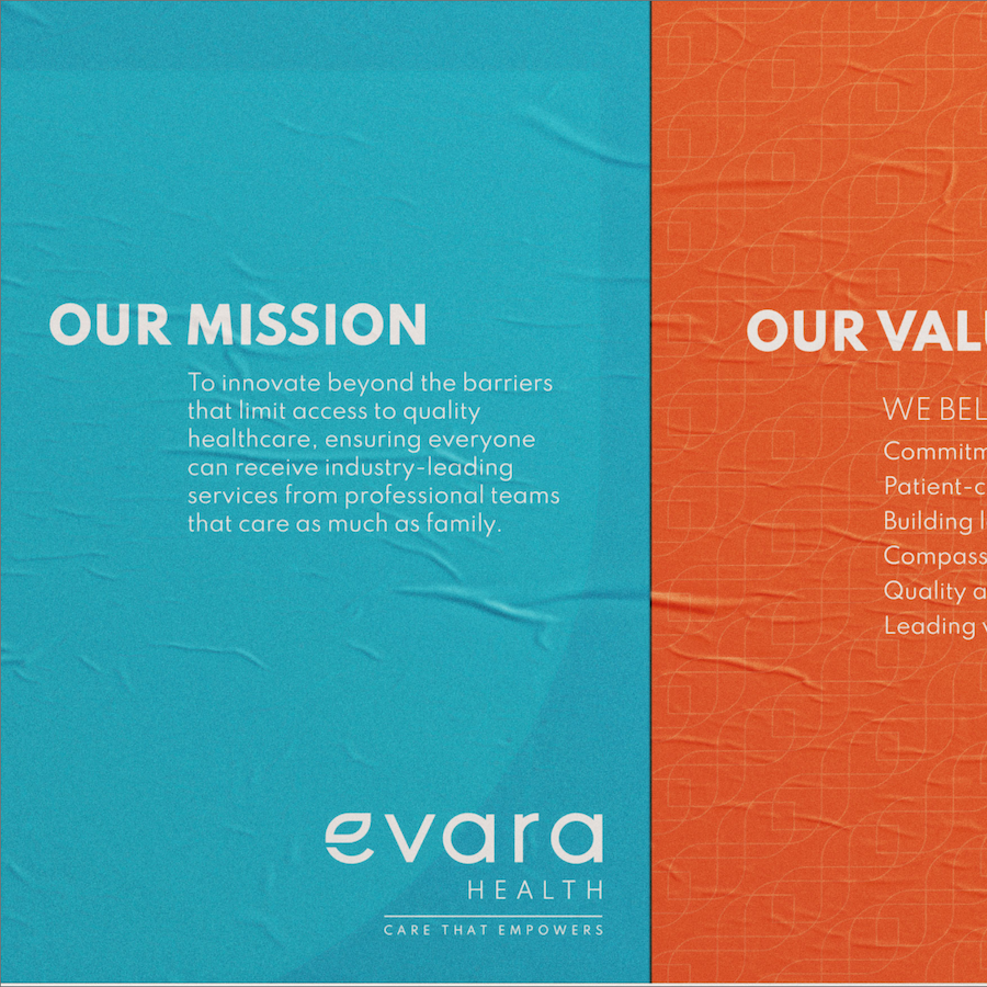
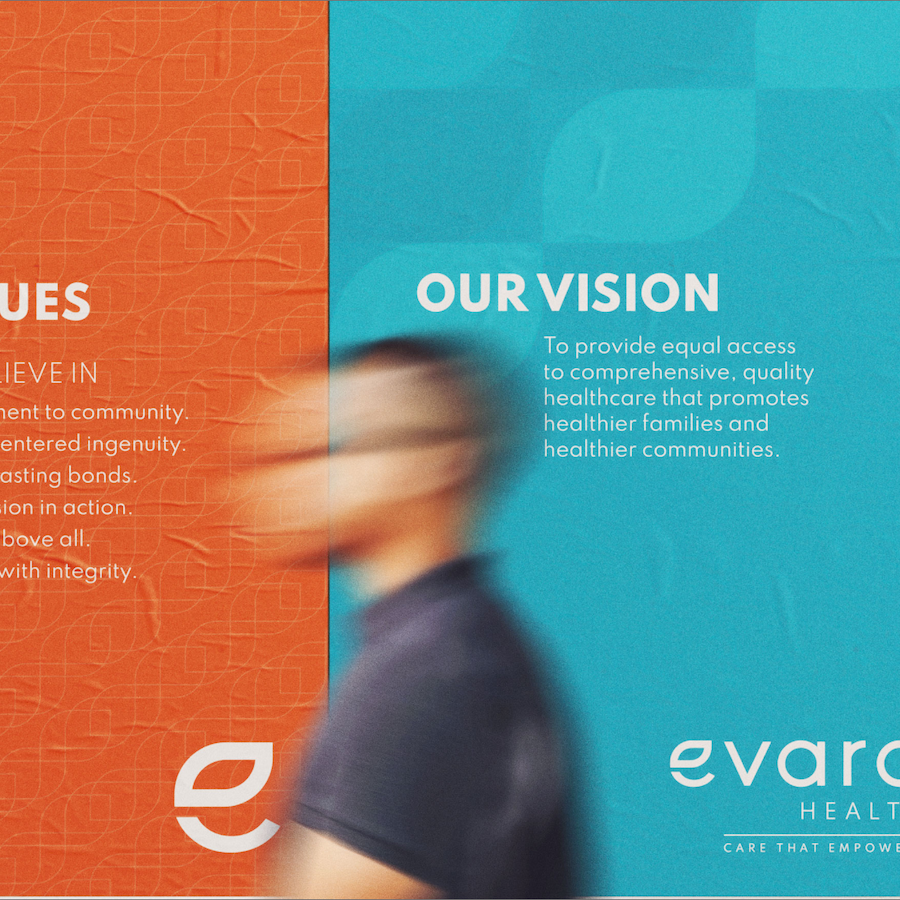


Our collective rebrand efforts went beyond supporting a 500+ team member internal launch with a keynote address, teaser communications toolkit, branded apparel, launch day video and comprehensive brand guide. It helped equip Evara Health to change the course of the future of not-for-profit healthcare.