June 7, 2019
How We Created a Tampa Icon


A brand is the single most important asset a company has, and we are often charged with finding the inspiration and ideas that bring this tangible asset to life. So being asked to create a new brand is a big honor – and one we don’t take lightly. Nearly a year after its launch, our team reflects on the ZooTampa logo and how the logo – which thrives today – was almost scrapped from the first client presentation.
“It felt different from the get-go…” – Curtis Elliot, Senior Art Director
Not every logo is created equal. Some carry more weight than others and some have the potential to become part of a culture or community. From the first agency kickoff meeting, the Zoo’s rebranding project came with higher stakes, knowing that generations of people held some of their most cherished memories connected to the Zoo. The new logo would need to honor the past while still moving forward.
“It’s probably too far.” – Charlie Militello, Associate Creative Director
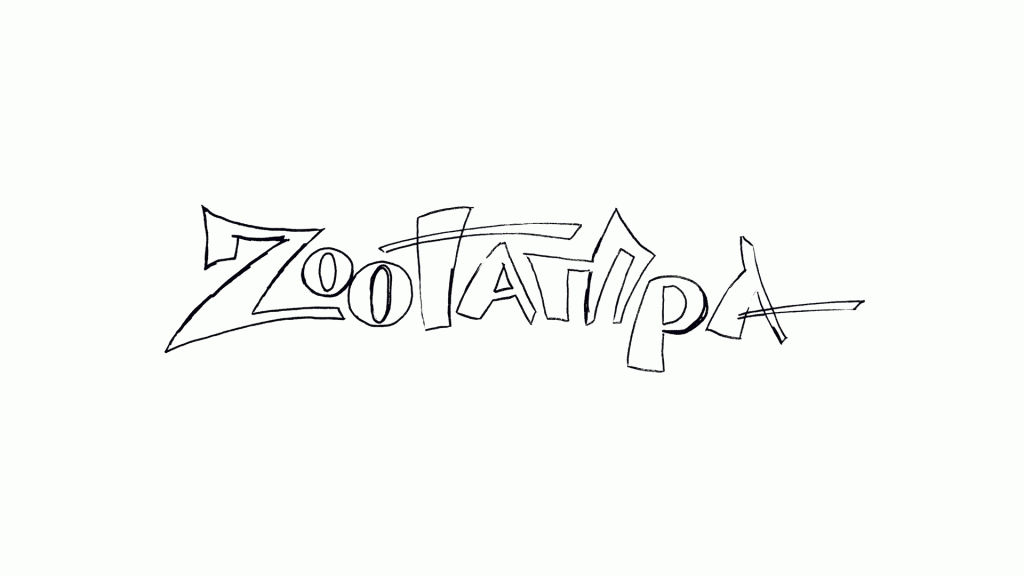
As the agency team was wrapping up the first internal meeting and talking about the client presentation, our senior account executive asked to see the sketches that didn’t make the cut…
“The energy was palpable.” – Katy Parsons, Senior Account Executive
As we looked through ideas in their most infant state, we spotted a very different take on the logo that caught our attention. Unlike the other concepts, it combined the words Zoo and Tampa = ZooTampa. It was one word that read like a verb vs. a noun. It evoked an instant sense of energy and motion.
“The unexpected ideas are always the best.” – Glenn Horn, Creative Director
We were inspired by the energy the ZooTampa concept continually brought to the client presentations – even as it evolved. Beyond the Zoo’s marketing team, the logo would need to be embraced by those who cherish the Zoo the most – the marketing committee, board and leadership team. Once again, the logo that almost wasn’t rose to the top of the pack.
“You always wonder if they’ll see it the same way we do.” – Kaitlyn Loos, Assistant Account Executive
Because the Zoo experience was now different from years past, the new logo was embraced by many once it launched for how it captured the vibrancy of a visit to the Zoo. There were still the select few that said, “it’s always Lowry Park Zoo to me!” Yet today, a year after its debut, the ZooTampa logo has taken on a life of its own – evoking the same sense of connection and exploration we all feel at the Zoo.
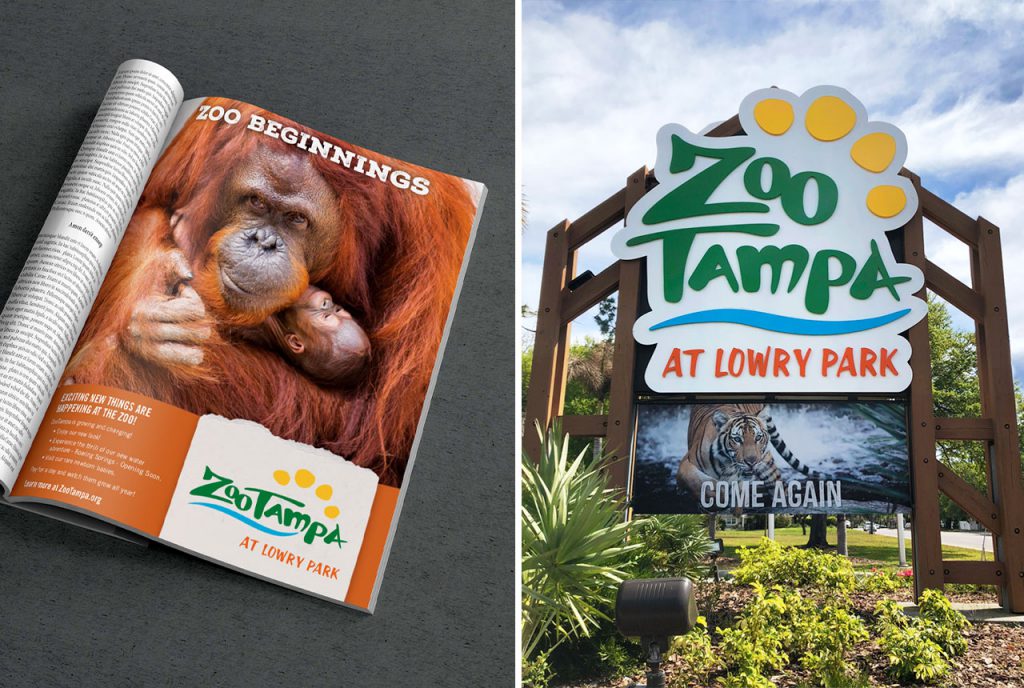
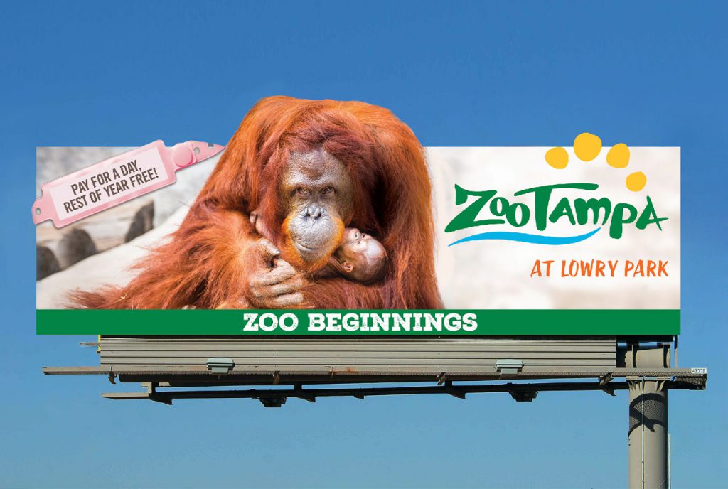
The ZooTampa logo is a point of pride for our entire agency. Here’s a look at how the sketch evolved into the logo you see today:
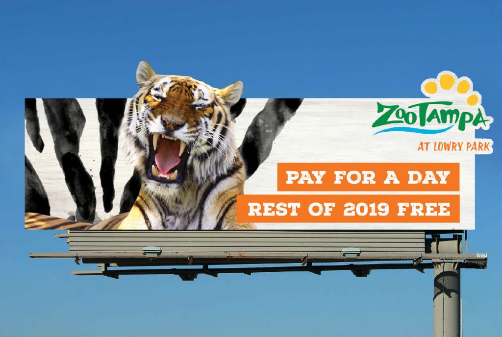
Here’s a look at how the ZooTampa logo came to life in campaigns this year:
We recently set down with the Business Observer to talk about how the ZooTampa brand has come to life – read all about here.